Notably Inaccessible
A data driven investigation into the (in)accessibility of data science notebooks.
Reading Summary
potluri2023notably (Potluri et al. 2023)
Title: Notably Inaccessible - Data driven understanding of data science notebook (in)accessibility. {ArXiv preprint, 2023} (19 pages).
Authors: Venkatesh Potluri, Sudheesh Singanamalla, Nussara Tieanklin and Jennifer Mankoff. (University of Washington)
Key words: data science, workflows, computing, accessibility.
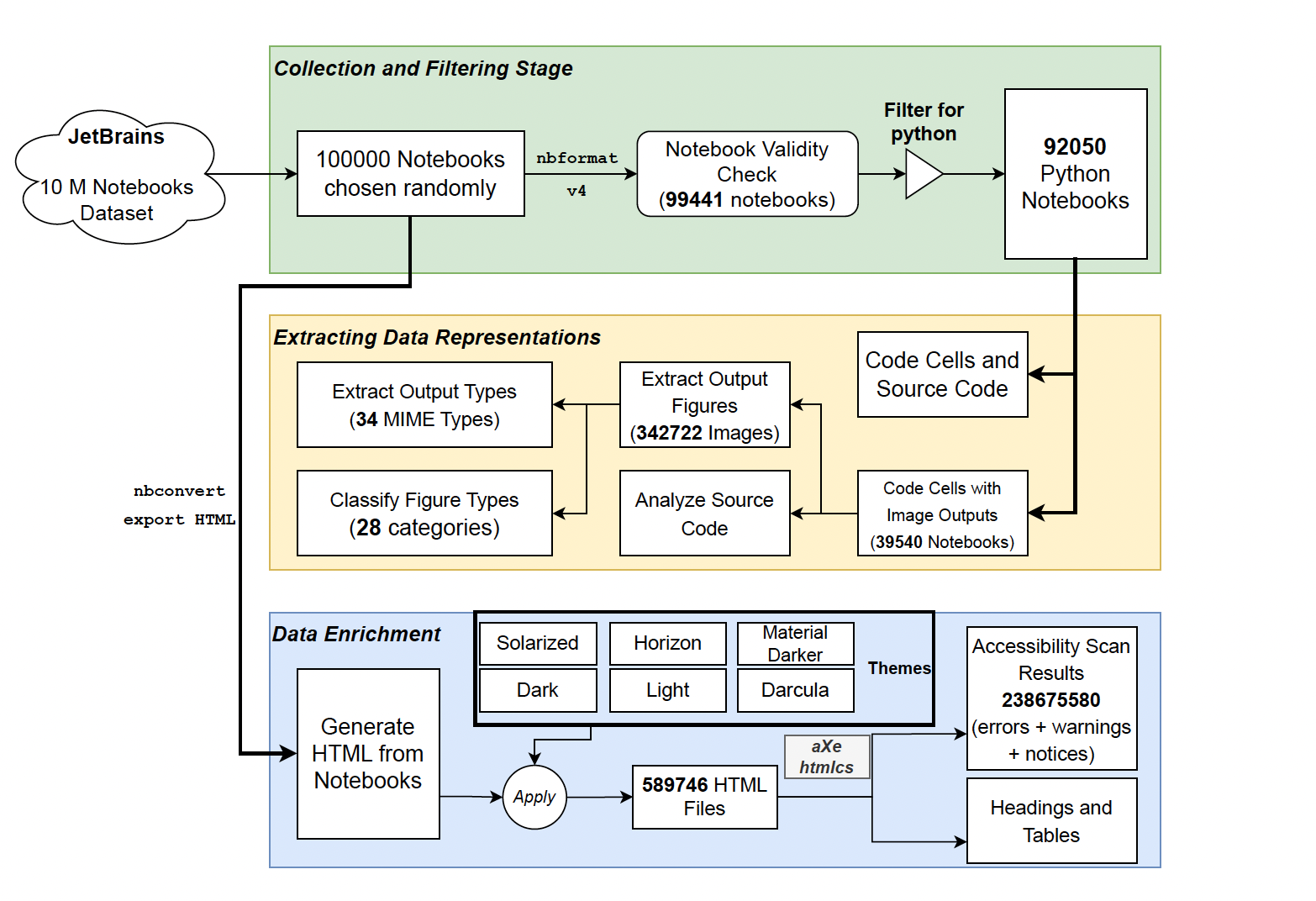
In this paper, the authors explore accessibility of literate programming approaches to blind and visually impaired users, both for the authoring and consumption of data science notebooks. They do this by conducting the first large-scale, empirical investigation into how notebooks are created and used in the wild, focusing strongly on Python-based analyses collated by Rule, Tabard, and Hollan (2018). This study is of interest data scientists and IDE developers who care about improving the accessibility of our workflows. The key findings suggest that the most immediate, individual impact can be made through consistent use of existing HTML tools, for example by providing alt-text for all generated figures and by using heading tags to facilitate document navigation.
Notes
The study makes a holistic assessment of the use of notebooks, investigating accessibility of:
- the integrated development environments used when authoring,
- the analysis and outputs performed within the notebooks,
- how those are presented in html format.
” Elavsky, Bennett, and Moritz (2022) extend web accessibility guidelines to make data visualizations accessible.” - Potential further reading.
pa11y accessibility scanning infrastructure, interesting for further investigation. I think this was one of the topics in a previous Tidy Tuesday visualisation challenge.
“Only studying notebooks that are presentation-ready assumes that BVI people’s involvement only as consumers of these notebooks and limits discovery of the extent of notebook accessibility problems.” - Yes! Strongly agree.
The authors use “a fully connected conventional neural network combined with a Fisher-Vector Convolution Neural Network, pre-trained on the DocFigure data set” to classify the chart types in the notebooks. A replication of this might be a fun exercise / mini-project in deep learning.
nbconvertis a pythonic, more focused version of pandoc.