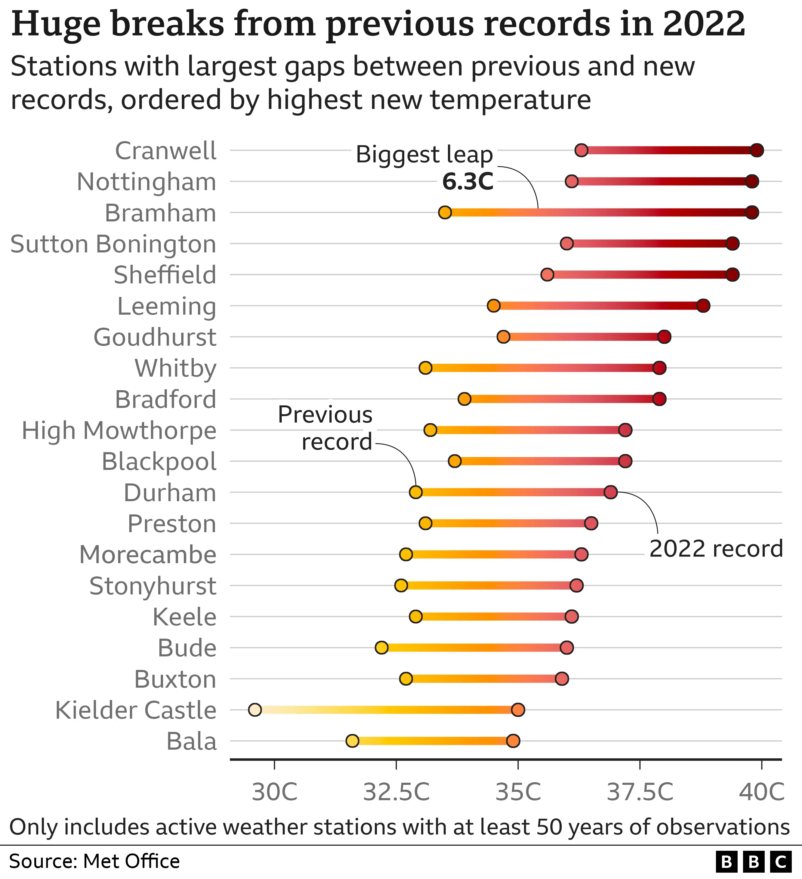
On Friday 2022-10-14, the BBC Data Journalism Team released this excellent article about the record temperatures in the UK during this summer’s heatwave. The article has some amazing data visualisations, and draws on a recent Met Office report.
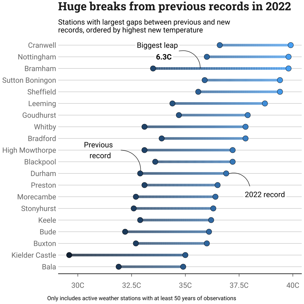
I wanted to try and recreate one of the plots to test the limits of my ggplot knowledge. Since I had already tackled a stacked bar plot, I figured I might have a go at their dumbbell plot that shows the weather stations which exceeded their previous records largest margins.
bbc temperature records dumbbell plot
I couldn’t find the data source, so spent far too long with a printed copy of the original figure to make my own version of the data set.
It took a while, but I got most of the way there with it and am happy with the final result.
my attempt at recreating the same plot
There were a few things that still have me stumped, that I might revisit at some later date:
If anyone with superior ggplot skills would like to help with those or give pointers, then I would be most grateful!
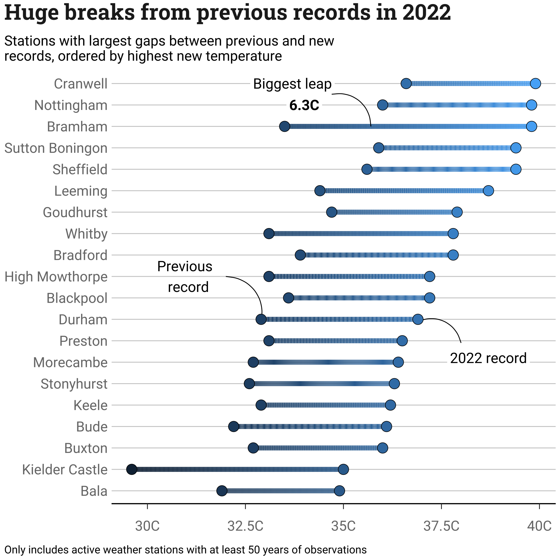
Code and figure down below ↓
Code
# Load packages ----library(bbplot)library(tidyverse)library(showtext)# Import fonts ----font_add_google(name ="Roboto Slab", family ="roboto-slab")font_add_google(name ="Roboto", family ="roboto")showtext_auto()title_font <-"roboto-slab"font <-"roboto"# Input data (estimated values from article) ---temperatures <- tibble::tribble(~location, ~max_prev, ~max_2022,"Cranwell", 36.6, 39.9,"Nottingham", 36.0, 39.8,"Bramham", 33.5, 39.8,"Sutton Boningon", 35.9, 39.4,"Sheffield", 35.6, 39.4,"Leeming", 34.4, 38.7,"Goudhurst", 34.7, 37.9,"Whitby", 33.1, 37.8,"Bradford", 33.9, 37.8,"High Mowthorpe", 33.1, 37.2,"Blackpool", 33.6, 37.2,"Durham", 32.9, 36.9,"Preston", 33.1, 36.5,"Morecambe", 32.7, 36.4,"Stonyhurst", 32.6, 36.3,"Keele", 32.9, 36.2,"Bude", 32.2, 36.1,"Buxton", 32.7, 36.0,"Kielder Castle", 29.6, 35.0,"Bala", 31.9, 34.9)# Data preparation ----## For the points ----temperatures <- temperatures |> dplyr::mutate(max_ever =pmax(max_2022, max_prev))temperatures$location <- forcats::fct_reorder(as.factor(temperatures$location), .x = temperatures$max_ever)temp_long <- tidyr::pivot_longer(temperatures, cols =c(max_2022, max_prev), names_to ="year",values_to ="temperature")## For the bars ----n_interp <-501temp_interpolated <-tibble(rep(NA, n_interp*20))temp_interpolated[[1]] <-rep(temperatures$location, each = n_interp)temp_interpolated[[2]] <-rep(NA_real_, n_interp*20)names(temp_interpolated) <-c("location", "interp_value")for (i in1:20) { temp_interpolated$interp_value[(1+ n_interp * (i -1)):(n_interp*i)] <-seq(temperatures$max_prev[i], temperatures$max_2022[i], length.out = n_interp)}str_wrap_break <-function(x, break_limit) {# Function from {usefunc} by N Rennie (https://github.com/nrennie/usefunc)sapply(strwrap(x, break_limit, simplify =FALSE), paste, collapse ="\n")}title_string <-"Huge breaks from previous records in 2022"subtitle_string <-str_wrap_break("Stations with largest gaps between previous and new records, ordered by highest new temperature",60)caption_string <-"Only includes active weather stations with at least 50 years of observations"p <-ggplot() +geom_line(data = temp_interpolated, aes(x = interp_value, y = location, color = interp_value), lwd =3) +#geom_label(aes(label ="2022 record", x =38.7, y =7.2), family = font, size =6.5, label.size =NA) +geom_curve(aes(x =38, y =7.9, xend =36.9, yend =8.9)) +#geom_text(aes(label ="Previous \n record", x =31, y =11), family = font, size =6.5) +geom_curve(aes(xend =32, yend =11, x =32.9, y =8.9)) +#geom_label(aes(label ="Biggest leap", x =33.7, y =20), family = font, size =6.5, label.size =NA) +geom_label(aes(label ="6.3C", x =34.0, y =19), family = font, fontface="bold", size =6.5, label.size =NA) +geom_curve(aes(xend =34.7, yend =19.5, x =35.7, y =18)) +#geom_point(data = temp_long, aes(x = temperature, y = location, fill = temperature), shape =21, color ="black", size =6) +#scale_x_continuous(breaks =seq(30, 40, by =2.5),labels =paste0(seq(30, 40, by =2.5),"C")) +#labs(title = title_string,subtitle = subtitle_string,caption = caption_string) +#theme(plot.title =element_text(family=title_font,size=28,face="bold",color="#222222"),plot.subtitle =element_text(family=font,size=18,margin=ggplot2::margin(9,0,9,0)),plot.caption =element_text(family = font, size =14,hjust =0),plot.title.position ='plot',plot.caption.position ='plot',axis.title = ggplot2::element_blank(),axis.text = ggplot2::element_text(family=font,size=18,color="grey47"),legend.position ="none",title =element_text(),axis.line.x =element_line(size =0.7, linetype ="solid"),axis.ticks.y =element_blank(),axis.ticks.length.x =unit(7, units ="points" ),axis.text.x =element_text(margin=margin(t =15, b =10)),panel.grid.minor = ggplot2::element_blank(),panel.grid.major.y = ggplot2::element_line(color="#cbcbcb"),panel.grid.major.x = ggplot2::element_blank(),panel.background = ggplot2::element_blank(), )p